Drop Recipes Empty States
Product Design - UX Writing - Illustration
The Drop Recipes App offers home cooks a wealth of useful features, while keeping the focus on creating delicious food with minimal hassle. This redesign of empty state screens was carried out to help promote of these features.
Introduction
Empty state and blank slate screens are presented within apps or websites when there is nothing to display - no files saved to your cloud storage for example, or no emails in your inbox.
They are also an often-missed opportunity to educate users on a products capabilities. The Drop Recipes App had been presenting inconsistent empty state layouts with generic imagery and vague copy, which informed users as to why there was nothing dispayed on these screens, but did nothing to educate or prompt action from the user.
Process
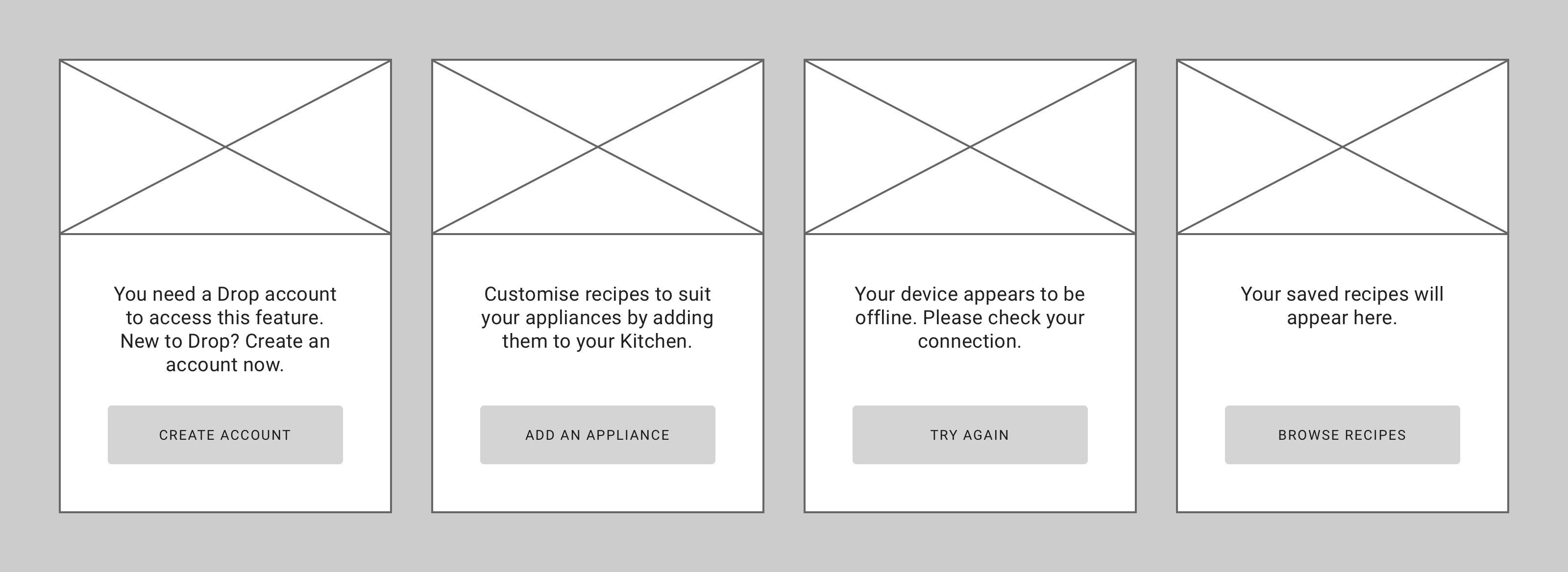
The existing screens didn't share one layout, so the first step was to lose this mix of layouts and develop a universal one. A requirement was that this new screen needed to be flexible enough to future-proof it against any empty state screens the app might need down the line.
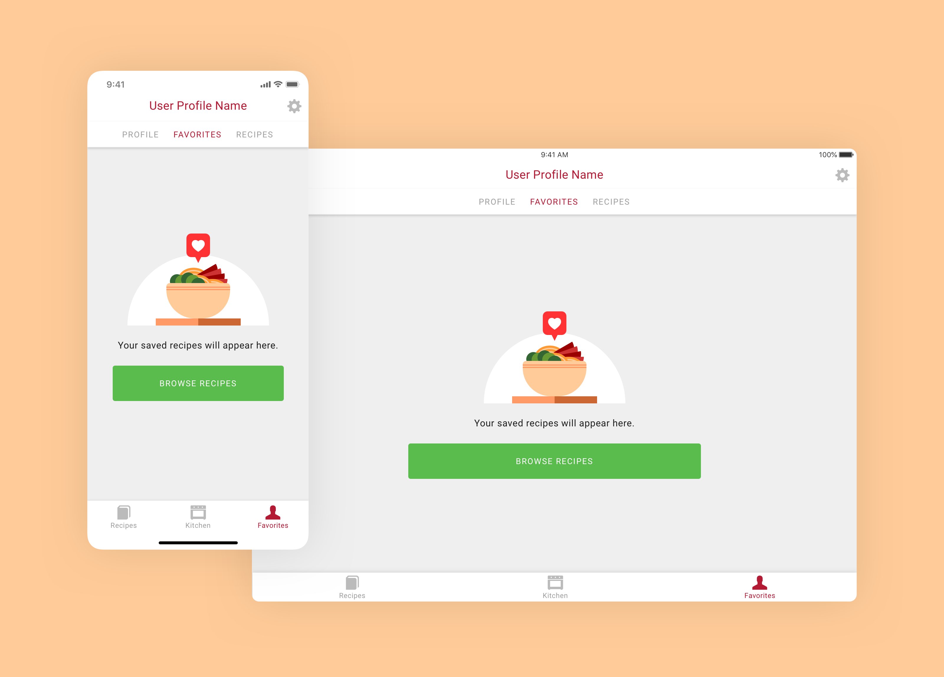
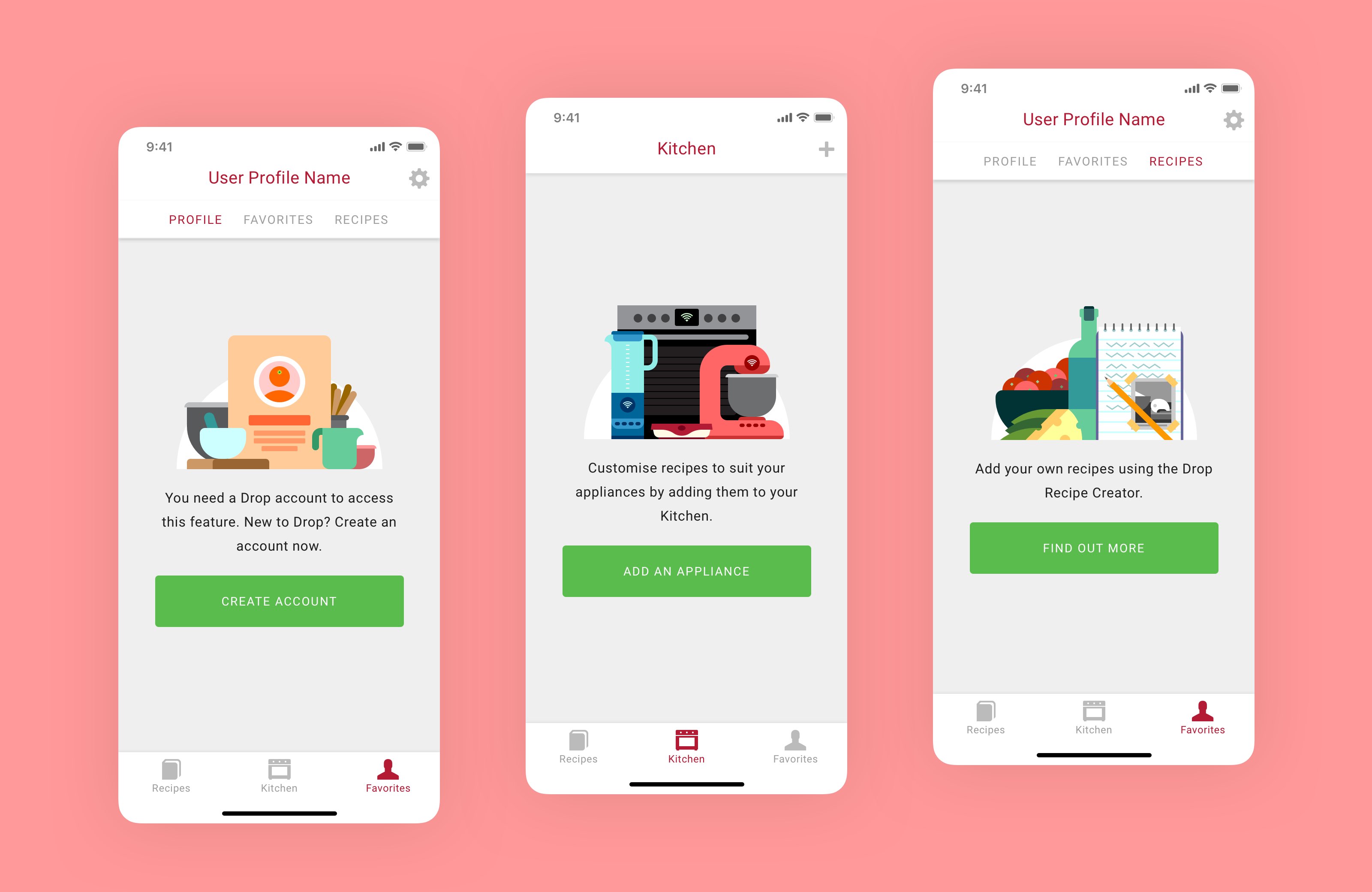
The new simple layout features an image with a block of text below it, and an optional button. Using a combination of imagery, copy and a call-to-action, the intention is to simultaneously demonstrate the purpose of this screen, and prompt users into discovering more.
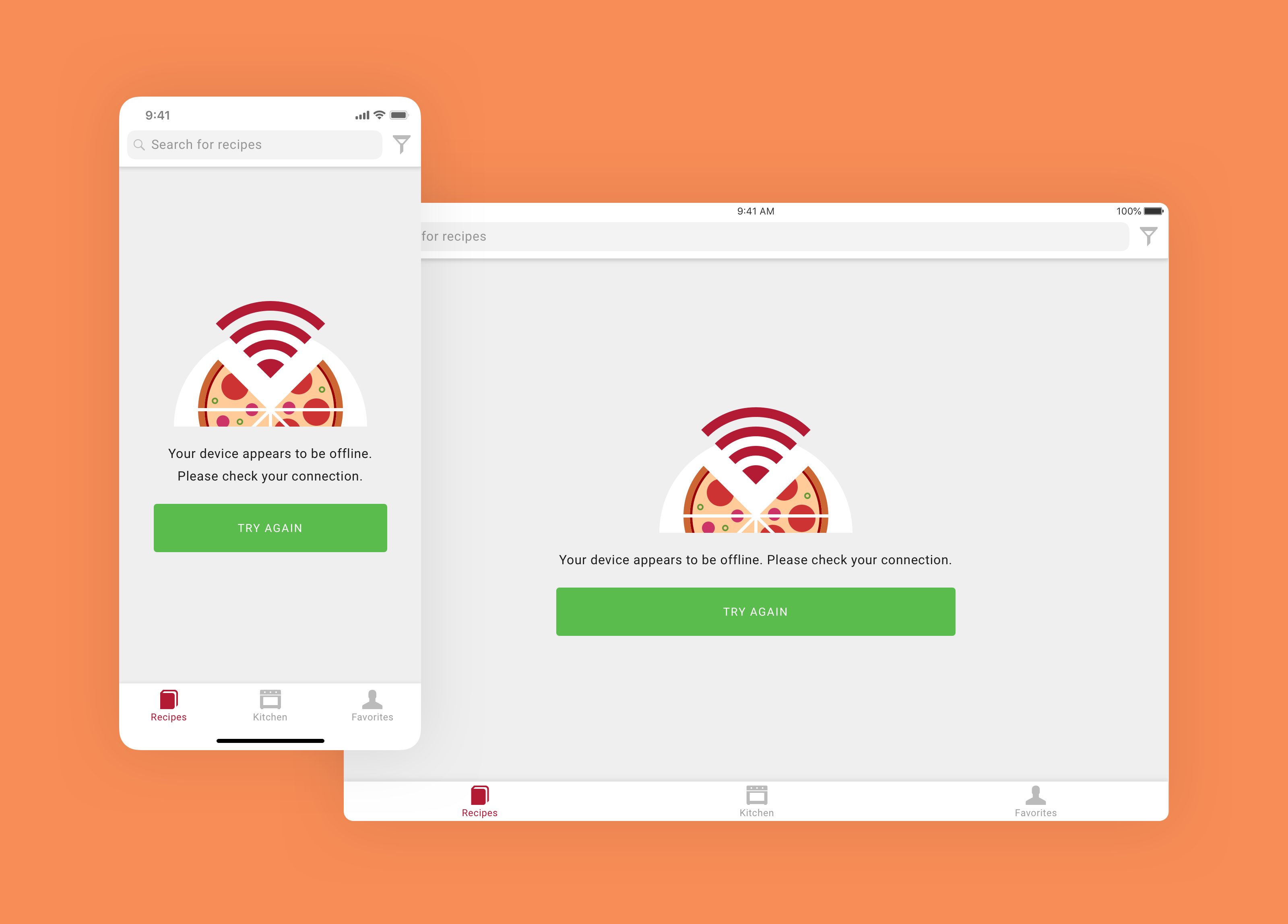
The new layout was also applied to our offline-warning screen. As one of the most commonly encountered error screens, we wanted to take the edge of this negative user experience by presenting a fun illustration, and more importantly, a call-to-action to help the user solve their problem, having the system check their connection again as they try to get back online.


Imagery
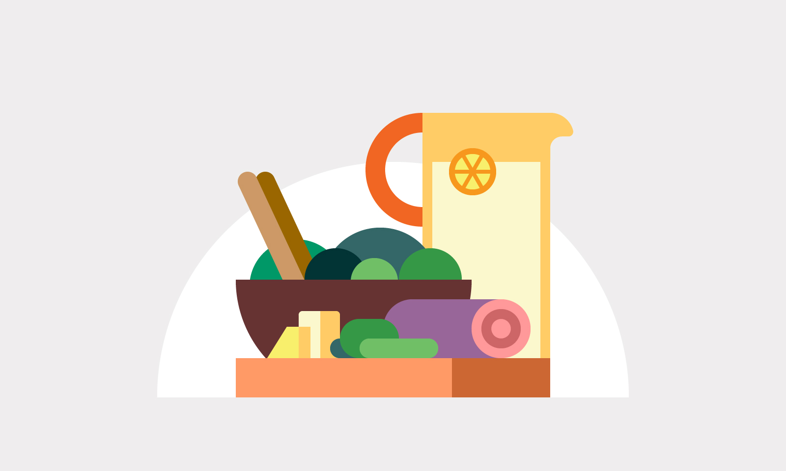
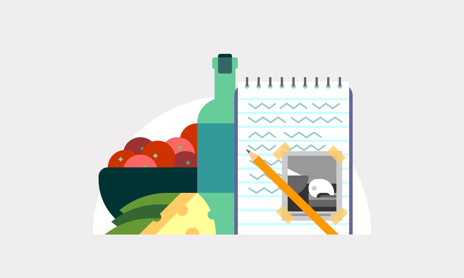
Illustrations were used to help avoid these screens becoming overly prescriptive. The featured imagery should be able to suggest multiple possibilities to the user, which would have been difficult to capture with photography.
These illustrations were drawn with simple graphic shapes and a laid-back colour palette, to be easily understood without seeming urgent. A white half-circle in the background of each illustration helps the image sit comfortably on top its accompanying text, no matter its composition.
The illustrations were drawn in Adobe Illustrator, at the minimum size required for the smallest supported device. Ensuring that all shapes had whole values and were placed squarely on pixels, the vectors were imported into Sketch. From here, they could be integrated into Drop's design system, and be easily exported at the required resolution, or in svg format.
Messaging
The golden rule of UX writing is to keep words to an absolute minimum. Long paragraphs describing the functionality of these screens were written, and then whittled down to the bare minimum. Particular attention was paid to the calls-to-action, to further drive home the purpose of these screens to the user.